


Coloured Greaseproof Paper Sheets: Ways to Boost Food Presentation
Using coloured greaseproof paper sheets is a simple yet profoundly effective way to boost food presentation and strengthen brand identity. In the visual economy of the modern food industry, the way a product looks is just as important as how it tastes. Color is a powerful tool that can influence mood, appetite, and perception of quality. By moving beyond standard white or brown paper, a food business can use colored sheets to create a vibrant, memorable, and highly shareable customer experience. This guide will provide a deep dive into the world of coloured greaseproof paper, exploring the psychology of color, popular applications, and strategic tips for using this amazing tool to make your food and brand unforgettable.
The Psychology of Color in Food Presentation
The use of color in your packaging is not just a decorative choice; it is a psychological one. Color has a direct and scientifically proven impact on the human brain. It can trigger emotions, create associations, and even influence our perception of flavor. A smart food business understands this psychology and uses color deliberately to create a specific experience for their customers.
How Color Influences Appetite and Perception
Certain colors are known to stimulate the appetite. Warm colors like red and yellow are often associated with energy and can increase feelings of hunger. This is why they are so prevalent in the branding of fast-food and casual dining restaurants. Other colors, like green, can signal health, freshness, and natural ingredients. The color of the packaging creates an expectation in the customer's mind before they even take their first bite.
The Meaning of Different Colors
Each color carries a set of cultural and psychological associations. A business can leverage these associations to communicate its brand values instantly. A thoughtful color choice can tell a story and create a specific mood. For a general overview of food-safe papers, the Parchment paper page offers useful context, though the materials are different.
Here are some common color associations in the context of food:
- Red: Associated with excitement, passion, and urgency. It is an appetite stimulant and a very powerful, attention-grabbing color.
- Yellow: Evokes feelings of happiness, optimism, and warmth. It is a cheerful and friendly color that is great for bakeries and breakfast spots.
- Green: The universal color for health, nature, and freshness. It is perfect for salad bars, vegan cafes, and businesses focused on organic ingredients.
- Blue: Conveys a sense of trust, calmness, and reliability. While less common as an appetite stimulant, it can be used for seafood brands or to create a calming atmosphere.
- Black: Signals luxury, sophistication, and elegance. It is a premium color that is perfect for gourmet, high-end products.
- Orange: A blend of the energy of red and the cheerfulness of yellow. It is associated with fun, creativity, and affordability.
- Pink: Often associated with sweetness, fun, and indulgence. It is a natural fit for dessert shops, candy stores, and bakeries.
- Brown: Evokes an earthy, rustic, and wholesome feeling. It is ideal for artisanal, all-natural, and traditional brands.
The Importance of Color Contrast with Your Food
When choosing a color for your paper, it is crucial to consider the color of your food products. The goal is to create a pleasing contrast that makes the food look as appetizing as possible. For example, a golden-brown baked good, like a croissant, will look fantastic against a rich, dark-colored paper like a deep blue or green. A colorful salad will pop against a clean, simple black or white background. Think of the paper as the plate or canvas for your food.
Using Color to Create a Specific Mood or Vibe
The color of your packaging is a key part of your brand's overall atmosphere or "vibe." A bright, multi-colored palette can create a fun, energetic, and family-friendly feel. A more limited palette of black, white, and a single accent color can create a look that is modern, minimalist, and sophisticated. The colors you choose should be a direct extension of the experience you want to create inside your establishment.
Exploring the Spectrum: Popular Colors and Their Applications
With a basic understanding of color psychology, we can explore how specific coloured greaseproof paper sheets can be used effectively for different types of food businesses. The right color choice will align with the brand's identity and enhance the specific products being sold.
Classic Red: For Diners, Barbecue, and Bold Brands
Red is a classic, high-energy color. It is a fantastic choice for businesses that want to create a sense of excitement and stimulate the appetite. It is the traditional color for diner-style baskets, making it perfect for serving burgers, hot dogs, and fries. It is also a natural fit for barbecue restaurants, as it complements the rich, dark colors of smoked meats. A bold, vibrant red paper is a statement of confidence.
Natural Green: For Health Food, Vegan Cafes, and Freshness
Green is the ultimate color for communicating health, freshness, and a connection to nature. It is the perfect choice for salad bars, juice bars, vegan and vegetarian cafes, and any business that focuses on fresh, organic ingredients. A deep, forest green can create a rich, natural look. A brighter, lime green can feel more energetic and modern. Using green paper reinforces the healthy choice the customer is making.
Sunny Yellow: For Bakeries, Breakfast Spots, and Happiness
Yellow is a cheerful, optimistic, and welcoming color. It is associated with sunshine and happiness, making it an ideal choice for bakeries, breakfast cafes, and businesses that sell comfort food. A soft, buttery yellow is a beautiful backdrop for pastries and baked goods. A bright, sunny yellow is great for wrapping breakfast sandwiches or lining a muffin basket. It is a color that is sure to make your customers smile.
Elegant Black: For Gourmet Burgers, Charcuterie, and Luxury
Black is the color of sophistication and luxury. A matte or gloss black greaseproof sheet can instantly elevate the perceived value of a product. It is an excellent choice for gourmet burger restaurants that want to create a high-end, premium experience. It is also the perfect liner for a charcuterie or cheese board, as it makes the colors of the meats and cheeses pop. For any brand that wants to be seen as elegant and refined, black is a powerful choice.
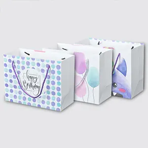
Playful Pink/Blue: For Desserts, Candy Shops, and Fun Brands
Pastel colors like pink and light blue are strongly associated with sweetness and fun. They are a natural fit for dessert parlors, ice cream shops, candy stores, and bakeries that specialize in cupcakes and macarons. These playful colors can create a sense of whimsy and nostalgia. They are perfect for brands that are targeting a younger audience or that want to create a fun, lighthearted atmosphere.
The Manufacturing and Safety of Coloured Greaseproof Paper
When using coloured greaseproof paper sheets for direct food contact, the safety and quality of the paper are the most important considerations. A reputable product is manufactured using specific processes and materials that are guaranteed to be non-toxic and safe for consumers.
The Dyeing and Printing Process
There are two ways that a greaseproof paper can be colored. In some cases, a food-safe dye is added to the paper pulp itself during the manufacturing process. This creates a sheet of paper that is a solid color all the way through. The more common method is to print a solid color onto the surface of a standard white or brown greaseproof sheet. This is done using the high-speed flexographic printing process.
The Critical Importance of Food-Safe, Non-Toxic Dyes
This is a non-negotiable safety requirement. Any dye or ink that is used to color the paper must be certified as food-safe. These are typically water-based or soy-based colorants that are made from ingredients that are safe for human consumption. A reputable manufacturer will never use standard, chemical-based printing inks for a food-contact product. Always ensure that your supplier can provide a certificate of food safety for their colored papers.
The Difference Between Solid Color Sheets and Printed Sheets
A sheet that has been dyed at the pulp stage will have a very deep and consistent color. A sheet that has been surface-printed with a solid color can also have a very vibrant look. The printed method offers more flexibility and is often more cost-effective for creating a wide range of different colors. From a performance standpoint, as long as both are made with food-safe materials, they are both excellent options.
Comparing the Process to Brown Greaseproof Paper Sheets
The process for making coloured greaseproof paper sheets is an extension of the process for making standard paper. The base paper, whether it is a bleached white or an unbleached brown greaseproof paper sheet, is made in the same way. The color is then added either at the pulp stage or as a final printing step. The key is that the added color must not compromise the paper's grease resistance or its food-safe properties.
Creative Ways to Use Coloured Sheets to Boost Presentation
The versatility of colored paper means that there are many creative ways a business can use it to enhance its presentation. A little bit of thought can turn a simple sheet of paper into a key part of the brand experience.
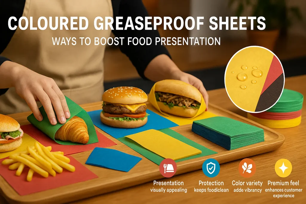
As a Vibrant Liner for Baskets, Trays, and Boxes
This is the most common and one of the most effective uses. A pop of color in the bottom of a serving basket or a takeaway box can dramatically improve the visual appeal of the meal. It shows a level of thought and care. A business can choose a single signature color to use for all its lining needs, creating a strong and consistent brand look.
As a Colorful Wrap for Sandwiches, Burgers, and Burritos
Using a colored sheet to wrap your main takeaway items is a fantastic way to make your products stand out. A brightly colored wrap is more eye-catching and memorable than a plain one. It also makes your product more photogenic and shareable on social media. It is a simple switch that can have a big impact on your brand's visibility.
Creating Themed Packaging for Holidays and Events
Colored paper is perfect for creating special, themed packaging for holidays or events. A café could use red and green paper during the winter holidays. They could use pastel colors for the spring. This shows that the brand is current and festive. It is a fun way to engage with customers and celebrate the season. This is a key benefit for any business, including those involved in high-volume catering with greaseproof paper sheets.
For Color-Coding Different Food Items
For businesses that sell a variety of similar-looking items, colored paper can be a practical organizational tool. A sandwich shop, for example, could use a different color of paper to wrap each type of sandwich. Green could be for the vegetarian option, red for the roast beef, and yellow for the chicken. This not only looks great but also helps staff to quickly identify orders and reduces the chance of errors.
Moving Beyond Solid Colors: The World of Patterns
The use of color can be made even more dynamic and unique with the addition of patterns. A patterned greaseproof paper adds another layer of visual interest and personality to your packaging.
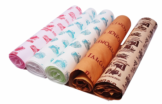
The Timeless Appeal of Gingham Greaseproof Paper Sheets
The gingham or "checkerboard" pattern is a timeless classic. It is strongly associated with picnics, diners, and traditional, wholesome food. A red and white gingham greaseproof paper sheet is the quintessential liner for a basket of fried chicken or french fries. A blue or green gingham can have a more modern, cafe-style feel. It is a pattern that is both nostalgic and stylish.
Stripes, Polka Dots, and Other Classic Patterns
Other simple, classic patterns like stripes and polka dots are also excellent choices. A paper with clean, modern stripes can look very sophisticated. A paper with playful polka dots can create a fun and whimsical feel. These simple geometric patterns are a great way to add personality to your packaging without creating a design that is too busy or cluttered.
Creating Custom Patterned Greaseproof Paper Sheets
For the ultimate in branding, a business can create its own custom pattern. This could involve using brand elements, like a simplified version of a logo or an icon, and turning them into a repeating pattern. The possibilities are endless. Creating your own patterned greaseproof paper sheets is a way to create a look that is absolutely unique to your brand.
How Patterns Add a Layer of Personality
A pattern can communicate a lot about a brand's personality. A simple, orderly pattern can feel professional and reliable. A more free-form or illustrative pattern can feel creative and artistic. The choice of pattern, just like the choice of color, should be a deliberate one that aligns with the overall brand identity.
Integrating Coloured Paper into Your Brand Strategy
To get the most out of your coloured greaseproof paper sheets, you should think of them as an integral part of your overall brand strategy. They should not be an afterthought. They should work in harmony with your logo, your store's interior design, and your other marketing materials.
Choosing a Signature Color that Represents Your Brand
The most powerful way to use color is to choose one or two signature colors and use them consistently across your entire brand. This consistent use of color is what builds brand recognition. Your customers will begin to associate that specific color with your business. This is a very powerful branding principle that can be easily implemented with colored paper.
Using Color to Differentiate Product Lines
If your business has several different product lines, you can use color to differentiate them. A bakery might use a cheerful yellow paper for its morning pastries and a more elegant, deep blue paper for its high-end dessert cakes. This helps to create a clear visual identity for each product category.
Creating a Cohesive Look with Your Logo and Other Packaging
The color of your greaseproof paper should complement your logo and your other packaging items, like cups and bags. All of these elements should look like they belong to the same family. This creates a cohesive and professional brand experience for the customer.
Sourcing Your Coloured Greaseproof Paper Sheets
When you are ready to implement this strategy, you will need to find a reputable supplier. It is important to choose a company that specializes in food-safe printing and can offer a wide range of options. There are many great suppliers who can provide high-quality coloured greaseproof paper sheets.
Final Thoughts
The use of coloured greaseproof paper sheets is a simple, affordable, and incredibly effective way for a food business to enhance its presentation and build its brand. Color is a powerful, non-verbal language that can instantly communicate your brand's personality and values. It can make your food look more appetizing, your packaging more memorable, and your customer's experience more special. By making a thoughtful and strategic choice about color, any café, restaurant, or bakery can turn a simple piece of paper into one of its most powerful marketing tools.
JERL has been working hard on the road of custom packaging. Next time when you feel the need to impress someone with your brand, think of JERL Packaging!