Coloured Greaseproof Paper Sheets: Trends in Packaging Design
The use of coloured greaseproof paper sheets has become a defining trend in modern food packaging design. In an industry where visual appeal is a critical component of the customer experience, color is one of the most powerful tools a business can wield. Moving beyond traditional white or brown paper, coloured sheets allow a brand to make a bold statement, create a specific mood, and build a memorable identity. These trends are not just about fleeting fashions; they are rooted in the psychology of consumer behavior and the ever-evolving language of design. This guide will explore the key trends in coloured greaseproof paper, revealing how businesses can use the power of color to enhance their packaging and captivate their customers.
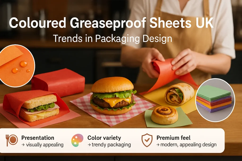
The Power of Color in Food Packaging Design
Color is the first thing a customer notices about your packaging. Before they read your logo or taste your food, they have an emotional reaction to the colors you have chosen. This reaction is subconscious but incredibly powerful. A strategic use of color can differentiate your brand, make your products look more appealing, and create a lasting impression that drives customer loyalty.
How Color Influences Customer Emotion and Choice
Colors have the power to evoke specific emotions and associations. A bright, warm color palette can make a brand feel energetic and friendly. A cool, dark palette can feel more sophisticated and luxurious. A brand can use this psychological impact to align their packaging with the experience they want to create. This emotional connection can be a deciding factor in a customer's purchasing decision and their overall perception of your brand's quality.
The Role of Color in Brand Differentiation
In a crowded marketplace, differentiation is key. If all your competitors are using standard white or brown packaging, choosing a unique and distinctive brand color is one of the easiest and most effective ways to stand out. A signature color can become a powerful brand asset. Over time, customers will begin to associate that color directly with your business, creating instant brand recognition on a busy street or in a social media feed.
Creating an "Instagrammable" Moment with Color
The "unboxing experience" is a crucial marketing touchpoint, and color is at the heart of it. A vibrant, beautifully colored wrapper turns a simple food item into a photogenic object. Customers are far more likely to take and share photos of a product that is packaged in an interesting and aesthetically pleasing way. This user-generated content is a form of authentic, word-of-mouth marketing that is invaluable for any modern food business.
Why the Base Paper Matters
The choice of base paper, while not a color itself, provides the canvas for your design. The two main options are bleached white and unbleached brown. A bright white base will make colors appear true and vibrant. An unbleached brown base will give colors a more muted, rustic, and earthy tone. The choice of base paper is the first step in creating your desired color palette.
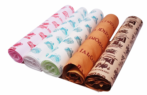
Trend 1: Earthy, Natural Tones
One of the most significant and enduring trends in packaging design is the move towards earthy, natural color palettes. This trend is a direct reflection of a broader consumer interest in wellness, sustainability, and authenticity. These are colors inspired by the natural world, and they create a sense of calm, grounded quality.
The Rise of Olive Greens, Terracotta, and Sandy Beiges
The specific colors driving this trend are muted and sophisticated. This includes shades like deep olive green, warm terracotta (a brownish-orange), rich clay reds, and soft, sandy beiges. These colors are complex and have a certain depth and warmth. They feel organic and real, a stark contrast to the artificial brightness of neon colors.
Why This Trend Connects with Health-Conscious Consumers
This color palette is a perfect match for businesses that focus on natural, organic, or health-conscious food. The earthy tones are a powerful visual cue that reinforces a message of wholesome, fresh, and unprocessed ingredients. For a vegan café, a salad bar, or an artisanal bakery, these colors instantly communicate the brand's core values to the target audience.
How These Colors Complement Artisanal Foods
Earthy tones are the ideal backdrop for artisanal food products. The muted colors allow the natural beauty of the food to take center stage. The rich browns of a loaf of sourdough bread, the vibrant greens of fresh herbs, or the golden crust of a pastry all look incredible against a background of olive green or terracotta. The packaging complements the food rather than competing with it. For a general overview of food-safe papers, the Parchment paper page offers some useful context, though the materials are different.
Trend 2: Bold, Saturated Jewel Tones
While the natural trend is strong, there is a parallel movement towards deep, rich, and luxurious jewel tones. This trend is all about creating a sense of indulgence, sophistication, and premium quality. These are the colors of precious gems, and they bring a feeling of opulence to food packaging.
The Appeal of Deep Emeralds, Sapphires, and Rubies
This trend is defined by its deep, saturated, and dramatic colors. Think of a rich emerald green, a deep sapphire blue, a vibrant ruby red, or a royal amethyst purple. These are colors that are bold and confident. They are not shy. They are designed to make a statement and to capture the customer's attention with their intensity.
Creating a Sense of Luxury and Indulgence
Jewel tones have a long historical association with royalty, wealth, and luxury. Using these colors in your packaging is a simple way to elevate the perceived value of your product. A simple cupcake or a piece of chocolate, when placed in a box lined with a deep emerald green paper, instantly feels more like an indulgent, gourmet treat. This is the power of color to transform perception.
How These Colors Make a Product Feel Premium
A deep, saturated color often signals a higher quality product. It takes a lot of high-quality pigment to create a rich, deep color, and this translates subconsciously to the customer. They assume that a brand that invests in such beautiful and expensive-looking packaging is also investing in high-quality ingredients for their food. This trend is perfect for gourmet food shops, high-end chocolatiers, and any business that wants to be seen as a premium brand.
Trend 3: Soft, Muted Pastels
The trend for pastel colors is an enduring one, especially in the world of desserts, bakeries, and cafes. Pastels are soft, light, and have a low saturation. They are colors that are gentle, calming, and often associated with sweetness and nostalgia.
The Enduring Popularity of Millennial Pink, Mint Green, and Baby Blue
The specific pastel shades that are most popular are often soft and sophisticated. This includes the famous "millennial pink," a soft, peachy pink. It also includes gentle mint greens, powdery baby blues, and soft lavender purples. These are colors that are easy on the eye and create a very pleasing and welcoming aesthetic.
The Psychology of Pastels: Fun, Whimsical, and Sweet
Pastel colors have a strong psychological association with sweetness, childhood, and lighthearted fun. They are the colors of candy, ice cream, and macarons. This makes them a perfect and almost instinctive choice for any business that sells sweet treats. They create a sense of whimsy and delight that perfectly matches the product.
Perfect for Bakeries, Dessert Shops, and Confectioners
A bakery that wraps its cupcakes in a soft pink paper, or a coffee shop that lines its pastry boxes with mint green, is creating a cohesive and appealing brand experience. These colors are a natural fit for the products. They enhance the feeling of it being a special, indulgent treat. This trend is all about creating a brand that feels friendly, approachable, and fun.
Trend 4: Minimalist Monochrome
The monochrome trend is about the power of simplicity. It involves using a very limited color palette of black, white, and shades of grey. This is a timeless and incredibly sophisticated approach to design. It is a choice for brands that want to create a look that is modern, elegant, and confident.
The Sophistication of Black, White, and Grey
A monochrome palette is the ultimate in understated elegance. It is clean, uncluttered, and always in style. It is a very confident design choice. It suggests that the brand does not need to use bright colors to get attention. Instead, it relies on the quality of its product and the strength of its simple, clean design.
Using Black Paper for a Dramatic, High-Contrast Look
A solid black greaseproof paper sheet is a very bold and dramatic choice. It creates a powerful, high-contrast background that can make food look incredibly striking. It is a very popular choice for gourmet burger restaurants, modern sushi bars, and high-end charcuterie businesses. A black liner in a takeaway box is a statement of premium quality.
The Cleanliness and Purity of White Greaseproof Paper Sheets
A crisp, clean sheet of white paper is the ultimate blank canvas. It is the epitome of the minimalist aesthetic. As we've explored, using white greaseproof paper sheets is a powerful way to signal cleanliness and purity. It allows the colors of the food to be the star of the show. It is a perfect choice for a brand that wants to be seen as modern, clean, and transparent.
The Technical Side of Color Trends
When choosing to use coloured greaseproof paper sheets, there are some important technical considerations to keep in mind. The production of these papers must adhere to strict safety standards, and the printing process requires a high level of quality control.
The Importance of Food-Safe Dyes and Inks
This is the most critical technical point. Any colorant used to produce a colored greaseproof paper must be 100% food-safe and non-toxic. A reputable manufacturer will use certified, water-based or soy-based dyes and inks that are completely safe for direct contact with food. Always ensure your supplier can provide the necessary food safety certifications for their products.
Achieving Color Consistency in Production
For a brand, color consistency is crucial. The signature green you use for your packaging must be the exact same shade in every batch you order. A high-quality manufacturer will use a computerized color matching system to ensure this level of consistency. This guarantees that your branding will always be perfect.
The Printing Process for Solid Color Sheets
A solid color sheet is typically produced by printing a solid layer of a single ink color onto a base paper using a high-speed flexographic press. This process can be used to create almost any color imaginable. For businesses looking for a truly unique shade, it is even possible to order custom-printed greaseproof paper sheets that are matched to a specific Pantone color.
How to Implement These Trends in Your Business
Choosing a trendy color is just the first step. The real art is in integrating that color into your brand strategy in a way that feels authentic and effective.
Here are some key questions to ask when implementing a color trend:
- Does this color align with my brand's core values? The trend should be a good fit for your brand's personality, not just a random choice.
- How will this color look with my specific food products? Always consider the contrast and overall visual appeal.
- Is this a long-term choice or a short-term promotion? You might choose a timeless color for your main brand and a trendier color for a seasonal special.
- How will this color work with my logo and other branding? The new color should be in harmony with your existing visual identity.
Aligning a Color Trend with Your Brand Identity
Do not just chase a trend for the sake of it. The most successful branding is always authentic. Before you adopt a new color, think about whether it truly reflects your brand's story. If you are a rustic, farm-to-table restaurant, the earthy tones trend is a natural fit. If you are a sleek, modern, high-end burger joint, the minimalist monochrome trend might be perfect. The trend should serve your brand, not the other way around.
Using Different Colors for Seasonal or Limited-Edition Products
A great way to experiment with trends without committing to a full rebrand is to use them for seasonal or limited-edition products. You could use a pastel color for a spring menu special. You could use a deep jewel tone for a luxurious holiday-season product. This keeps your brand looking fresh and dynamic.
The Practicalities of Using Large Greaseproof Paper Sheets
When implementing these trends, consider the practical formats you will need. For lining large trays or for use as a work surface, a large greaseproof paper sheet or even a greaseproof paper full sheet is the most efficient choice. For wrapping individual items, a smaller, pre-cut sheet is better.
Final Thoughts
The trends in coloured greaseproof paper sheets offer an exciting palette of possibilities for any food business. From the grounded authenticity of earth tones to the luxurious depth of jewel tones, there is a color trend to suit every brand identity. By making a strategic and thoughtful choice about color, a business can transform its packaging from a simple necessity into a powerful marketing tool. Color is a language that speaks directly to your customers. Choosing the right words will help you to tell a compelling story, create a memorable experience, and build a brand that people truly love. Whether used for wrapping a sandwich or lining a baking sheet with greaseproof paper, color adds a vital layer of personality.
JERL has been working hard on the road of custom packaging. Next time when you feel the need to impress someone with your brand, think of JERL Packaging!