
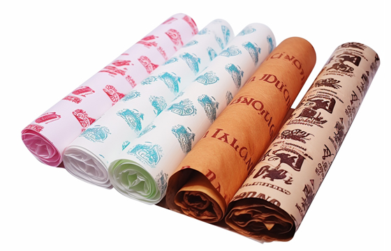


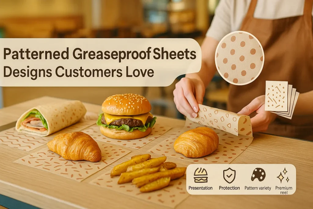
パターン付き耐油紙シート: 顧客に愛されるデザイン
パターン化された耐油紙シートを使用することは、食品ビジネスがプレゼンテーションを向上させ、記憶に残るブランド アイデンティティを作成するための洗練された非常に効果的な方法です. 競争の激しい料理の世界で, 視覚的な魅力が最も重要です. 適切に選択されたパターンは、ラッパーを飾るだけではありません; それは個性を伝えます, ムードを作り出す, そして、顧客とあなたの食べ物とのやり取りを楽しい体験に変えます. クラシックから, 時代を超越したデザインから大胆さへ, 最新のグラフィックス, パターンは、視覚的に説得力のある方法でブランドのストーリーを伝える素晴らしい機会を提供します. このガイドでは、柄入り耐油紙の世界を深く掘り下げます, パターンの心理学を探る, 人気のデザインの選択, そして、それらを活用して顧客が絶対に気に入る外観を作成する方法.
ブランディングとパッケージにおけるパターンの心理学
パターン, 色によく似ています, 強力な心理的影響を与える. これらは、私たちの脳が自然に認識して解釈するように配線されているビジュアル デザインの基本的な要素です. パターンは、ブランドに対する顧客の認識に影響を与える可能性があります, よりプロフェッショナルに感じる, 遊び, 瀟洒, または素朴. この心理学を理解することは、意図したメッセージを効果的に伝えるパターンを選択するための第一歩です.
パターンが視覚的な質感と面白さを生み出す方法
無地はフラット. パターンが視覚的なテクスチャを導入, 深さ, そしてリズム感. それは無表情な表面を壊し、目に何か興味深いものを与えます. この視覚的なディテールの追加により、パッケージはより思われ、優れたデザインに感じられます. シンプルなラッパーを退屈な必需品から心地よいデザイン要素に変えます. この視覚的な関心の向上は、魅力的で高品質のプレゼンテーションを作成するための鍵となります.
幾何学模様と有機模様の違い
パターンは一般に 2 つの大きなカテゴリに分類できます. 幾何学模様は、線のような繰り返しの形状で構成されています, 正方 形, 円, と三角形. これらのパターンは、多くの場合、整然と感じられます, モダン, そして構造化されている. 自然からインスピレーションを得た有機パターン. 流れるようなラインが特徴です, 花のモチーフ, 葉, その他の自然な形. これらのパターンは、よりリラックスした感じがする傾向があります, 職人, そしてエレガント. 幾何学模様か有機模様かの選択は、ブランディングの基本的な決定です.
パターンを使って雰囲気を演出する
選択するパターンの種類は、ブランドの雰囲気を設定するのに役立ちます. 遊び心のある水玉模様は、楽しさと懐かしさを生み出すことができます, 駄菓子屋やアイスクリームパーラーに最適. クリーンな, ミニマルなストライプパターンは、モダンな洗練感を生み出すことができます, 高級カフェに最適. 素朴な, 手描きの植物模様は自然な感覚を呼び起こすことができます, 農場から食卓までの品質. このパターンは、あなたのブランドが何であるかを顧客に伝える非言語的な手がかりになります.
パターンが開封体験をどのように向上させるか
テイクアウト食品用, パッケージは、顧客が最初に目にするものです. 美しい模様がこれを引き立てます "アンボクシング" 一瞬. それは期待と喜びの層を追加します. サンドイッチの包装を開けたり、ペストリーの箱を開けたりする体験が、プレゼントを開けたような感覚になります. このポジティブな体験は非常に記憶に残り、顧客満足度とロイヤルティの重要な原動力となります. また、製品が写真に撮られ、ソーシャルメディアで共有される可能性もはるかに高くなります. 食品安全論文の概要, ザ クッキングシート ページはいくつかの有用なコンテキストを提供します, 素材は違うけど.
古典的な幾何学模様の探索
幾何学模様は時代を超越しています. それらは単純なものの上に構築されています, 形と線の普遍的な言語. その秩序と対称性により、信じられないほど多用途で魅力的です. 古典的な幾何学模様は、多くの場合、幅広い食品ビジネスにとって非常に安全で効果的な選択肢です.
ギンガムチェックの時代を超越した魅力
ギンガムチェックは、間違いなく食品包装で最も象徴的なパターンです. このシンプルな市松模様のデザインは、ピクニックの気分を呼び起こす時代を超越したクラシックです, 家庭料理, そして素朴な魅力. ダイナーにとって典型的なパターンです, バーベキュージョイント, そして伝統的なパン屋. 赤と白のギンガムチェックは最も古典的な組み合わせです, しかし、パターンはさまざまな色で美しく機能します. 青と白のギンガムチェックは、新鮮で海岸沿いの感じがします, 一方、白黒のギンガムチェックは驚くほどモダンでシックに見えます. の汎用性 ギンガムチェック耐油紙シート 彼らは永遠のお気に入りになります.
ストライプのクリーンなモダンさ
シンプルなストライプ柄が控えめなエレガンスの達人. 薄い, すっきりとしたストライプは洗練された外観を作り出すことができます, プロ, そして非常にモダン. パリのパティスリーや高級菓子店を連想させることが多い柄です. 縦縞は高さ感と優雅さを演出できます, 横縞はよりリラックスしてクラシックに感じられますが. ストライプの色も大きなインパクトがあります. シンプルな白地に黒のストライプは時代を超越した選択です. よりカラフルなストライプは、より遊び心とエネルギッシュさを感じることができます.
水玉模様の遊び心のある雰囲気
水玉模様は本質的に楽しいものです. 円を繰り返すこのシンプルなパターンが陽気です, 気まぐれ, そしてしばしば少しレトロ. 楽しいものを投影したい企業に最適です, 友好的, そして親しみやすいイメージ. 水玉模様はデザートショップに最適です, アイスクリームパーラー, カップケーキベーカリー, 家族や子供を対象としたブランド. ドットのサイズと間隔によっても感触が変わる, 小さいから, デリケートなドットから大きなものまで, 太字のもの.
シェブロンとヘリンボーンの洗練さ
幾何学的でありながら、もう少しダイナミックなエネルギーを持つ外観のために, シェブロン (ジグザグパターン) とヘリンボーンは優れた選択肢です. これらのパターンは動きと洗練の感覚を生み出します. 微妙な, トーンオントーンのシェブロンパターンは、信じられないほど豪華で高級に見えます. インテリアデザインやハイファッションで人気の選択肢です, そして、それはパッケージにも美しく変換されます. モダンに見られたいブランドのための柄です, 格好いい, そしてトレンドに.
有機的パターンとテーマパターンの探索
有機的なパターンは、より柔らかい, 幾何学的デザインの構造に代わる、より自由な選択肢. これらのパターン, 自然界にインスパイアされた, エレガンスを伝えたいブランドに最適です, 信頼性, そして自然とのつながり.
エレガントなタッチの花柄
繊細な花柄は信じられないほど美しくエレガントです. 高級ベーカリーに最適です, ティーショップ, ウエディングケーキやその他のお祝いのお菓子を専門とする企業. ヴィンテージスタイルの花柄は、懐かしさとロマンスの感覚を呼び起こすことができます. より現代的な, 抽象的な花は芸術的で現代的な感じがします. 花柄は、パッケージに美しさと女性らしさを加える方法です.
自然な雰囲気を演出する植物と葉の模様
ナチュラルにこだわったブランド向け, 有機, または植物ベースの食品, ボタニカル柄がぴったりです. 単純な, 葉の繰り返しパターン, シダ, またはハーブは、ブランドの価値を強化する直接的な視覚的手がかりです. 新鮮さのメッセージを瞬時に伝えます, 健康, そして地球とのつながり. このタイプのパターンは、ビーガンカフェに最適です, 健康食品店, そして農場から食卓までのレストラン.
クリエイティブなブランドのための抽象的で芸術的なパターン
大胆なブランドに, モダン, そしてクリエイティブ, 抽象的なパターンは素晴らしい選択です. これは絵画的な色のしぶきかもしれません, 手描きの波線の連続, または複合施設, 芸術的なデザイン. 抽象的なパターンは、真にユニークで記憶に残る外観を作成する方法です. それはあなたのブランドが創造的であることを示しています, 奇抜, そして群衆から目立つことを恐れません.
休日や特別イベントのテーマパターン
型紙を使うのは、休日や特別な日を祝う素晴らしい方法です. 企業は冬休みにお祝いの模様の紙を使うことができます, ハロウィンの不気味なパターン, またはバレンタインデーのロマンチックなパターン. これにより、ブランドが熱心でお祭り気分になっていることが顧客に示されます. これは、パッケージを一年中新鮮で関連性のある状態に保つ簡単な方法です.
カスタムブランドパターンの力
綺麗な在庫パターンもたくさんありますが、, このブランディング ツールを活用する究極の方法は、独自のカスタム パターンを作成することです. カスタムパターンは、あなたのビジネスに完全に固有の独自のデザインです. これは、顧客がすぐに認識できる強力なブランディング資産です.
ストックパターンを超えてユニークなデザインへ
カスタム パターンを使用すると、ブランド固有のアイデンティティに完全に一致する外観を作成できます. 標準オプションに限定されません. デザイナーと協力して、ブランドの色を取り入れたパターンを作成できます, 図形, そして、ストックパターンではできないような全体的な雰囲気.
ロゴやブランドアイコンを繰り返し要素として使用する
カスタム パターンを作成する最も一般的な方法は、ロゴやその他のブランド アイコンを繰り返し要素として使用することです. これは、ブランド認知度を高めるための非常に効果的な方法です. 適切にデザインされたパターンは、完全なロゴが見えないときでも見栄えがします. これは真に創造するための重要な部分です カスタム印刷された耐油紙シート.
プロプライエタリの利点, 認識可能なパターン
時間の経過とともに, カスタムパターンは、ロゴ自体と同じくらい認識しやすくなります. 高級ファッションブランドが使用する象徴的なパターンを考えてみてください. これは長期的なブランディング戦略です. ユニークで一貫性のあるパターンは、ビジネスにとって貴重な知的財産になる可能性があります.
効果的な型紙の設計原則
ストックパターンを選択する場合でも、カスタムパターンを作成する場合でも, 留意すべき重要な設計原則がいくつかあります. これらは、効果的なデザインを作成するのに役立ちます, 格好いい, そしてプロフェッショナル.
スケールと繰り返しの重要性
パターンの規模は重要な決定です. 大規模なパターンは、大胆でドラマチックにすることができます. 小さなパターンは、より繊細で詳細に感じることができます. ラッピングするアイテムのサイズに適したスケールを選択することが重要です. パターンの繰り返し方も重要です. 単純な, グリッドのようなリピートはとても整然と感じます, 一方、オフセットやランダムに見えるリピートは、より有機的でダイナミックに感じられます.
色彩理論: パターンのパレットの選択
パターンのカラーパレットは重要です. 単色のパターン, 同じ色の異なる色合いを使用します, 非常に洗練され、控えめにすることができます. ハイコントラストパレット, 白地に黒のように, 太字で読みやすいです. マルチカラーのパレットは楽しくてエネルギッシュになります. パターンの色は常にメインのブランドカラーと調和している必要があります. パターンを使用することは、単純なものに視覚的な面白さを加える優れた方法です カラー耐油紙シート.
パターンの複雑さと読みやすさのバランス
複雑さと適切なバランスを見つけることが重要です. 非常に密度が高く詳細なパターンは、時にはそうなることがあります "忙しい。" ロゴの上に印刷すると、ロゴが見えにくくなる可能性があります. また、食品自体を視覚的に圧倒することもあります. よく, より単純な, よりオープンなパターンはより効果的です. 目標は、パターンを美しい背景にすることです, ショーの主役ではない.
考慮すべき重要な設計原則をいくつか示します:
- 規模: 製品に適したパターンスケールを選択してください. 小さなペストリーのための小さなパターン, 大きなサンドイッチラップ用の大きめのもの.
- カラーパレット: パターンの色がブランド アイデンティティと一致し、食品の色を引き立てることを確認してください.
- 複雑さ: よりシンプルな, more open patternは、多くの場合、過度に忙しいパターンよりも用途が広く専門的です.
- ブランド統合: パターンの上にロゴを追加する場合, 読みやすいように周囲に十分なスペースがあることを確認してください.
- 永遠: 数年後も似合うパターンを選びましょう. 長期的な解決策を探している場合は、流行しすぎるものは避けてください.
ビジネスに適したパターンの選び方
あなたのビジネスに最適なパターンは、ブランドの個性を忠実に反映し、ターゲット顧客にアピールするパターンです. さまざまな種類の食品ビジネスに関するいくつかの提案を次に示します.
クラシックなダイナーやバーベキュー店に
レトロなビジネスのために, アメリカーナ感, ギンガムチェック柄は誰もが認めるチャンピオンです. 定番です, 懐かしい, そしてこのスタイルの食べ物にぴったりです. レトロなカラーパレットのシンプルなストライプや水玉模様も最適です.
モダンな, ミニマリストカフェ
清潔感のあるモダンなカフェ, ミニマリストの美学は、これを反映したパターンを選択する必要があります. 単純な, モノクロの配色に細いストライプパターン (白地にグレーのように) 非常に効果的でしょう. 微妙な, 小規模な幾何学模様もうまくいきます. 目標はエレガンスとシンプルさです.
職人技のベーカリーのために
ナチュラルを重視した職人技のベーカリー, 手作りの製品は、有機的な感触のパターンを選択する必要があります. 手描きの植物や花柄は美しい選択でしょう. 重要な成分に基づくカスタムパターン, 麦の茎のように, また、非常に効果的でしょう. 多くの場合、これらのビジネスには天然茶色の原紙が最適です.
楽しいデザートやキャンディーショップに
楽しさと贅沢がすべてであるビジネスのために, 遊び心のあるカラフルなパターンは必須です. 鮮やかな色の水玉模様, 楽しい抽象的な波線, または、アイスクリームコーンやキャンディーのテーマパターンが完璧です. 目標は、喜びと興奮の感覚を生み出すことです.
技術的および生産上の考慮事項
デザインが完成したら, 考慮すべき技術的要因がいくつかあります. これらは、 パターンド耐油紙シート.
詳細なパターンの印刷プロセス
詳細な, マルチカラーパターンは、単純なロゴと同じフレキソ印刷プロセスを使用して印刷されます. しかし, より複雑な設計では、より多くの印刷版とより複雑なセットアップが必要になります, コストが増加する可能性があります. パターンのすべての細部がきれいかつ鮮明に印刷されるように、アートワークを高解像度のベクター形式で提供することが重要です.
食品に安全なインクと材料の確保
これは重要な安全要件です. パターンの印刷に使用されるすべてのインクは、食品に安全で無毒であると認定されている必要があります. 原紙本体, 漂白されているかどうか 白い耐油紙シート または無漂白のもの, また、食品グレードの材料でなければなりません. これらの安全認証を提供できる信頼できるサプライヤーと常に協力してください.
最終的な考え
柄入りの耐油紙シートの使用は、食品ビジネスが明確で記憶に残るブランド アイデンティティを作成するための非常に効果的な方法です. 厳選されたパターンは単なる装飾ではありません; 強力なコミュニケーションツールです. 雰囲気を盛り上げることができます, ストーリーを語る, そして顧客との深い感情的なつながりを築きます. ギンガムチェックの時代を超越した魅力から、カスタムデザインのブランドパターンのモダンなエレガンスまで, 可能性は無限大. デザインについて戦略的に考え、ブランドの核心を真に反映するパターンを選択することで, 日常の食品パッケージを最も効果的なマーケティング資産に変えることができます.
JERLはカスタムパッケージの道を歩んできた. 次回、あなたのブランドで誰かに好印象を与える必要があると感じたとき, JERLパッケージを思い浮かべてください!