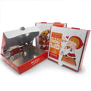


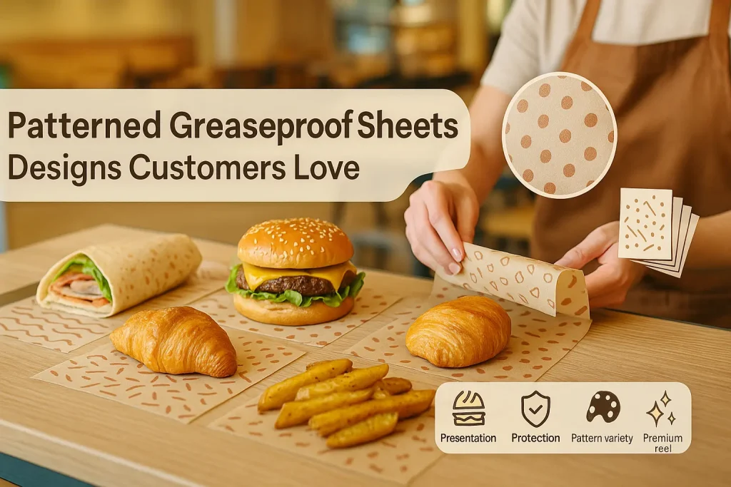
Patterned Greaseproof Paper Sheets: Designs Customers Love
Using patterned greaseproof paper sheets is a sophisticated and highly effective way for a food business to elevate its presentation and create a memorable brand identity. In the competitive culinary world, visual appeal is paramount. A well-chosen pattern does more than just decorate a wrapper; it communicates a personality, creates a mood, and transforms the customer's interaction with your food into a delightful experience. From classic, timeless designs to bold, modern graphics, patterns offer an incredible opportunity to tell your brand's story in a visually compelling way. This guide will provide a deep dive into the world of patterned greaseproof paper, exploring the psychology of patterns, popular design choices, and how you can leverage them to create a look that your customers will absolutely love.
The Psychology of Patterns in Branding and Packaging
Patterns, much like colors, have a powerful psychological impact. They are a fundamental element of visual design that our brains are naturally wired to recognize and interpret. A pattern can influence a customer's perception of your brand, making it feel more professional, fun, elegant, or rustic. Understanding this psychology is the first step in choosing a pattern that will effectively communicate your intended message.
How Patterns Create Visual Texture and Interest
A solid color is flat. A pattern introduces visual texture, depth, and a sense of rhythm. It breaks up a plain surface and gives the eye something interesting to engage with. This added layer of visual detail makes the packaging feel more thoughtful and well-designed. It turns a simple wrapper from a boring necessity into a pleasing design element. This increased visual interest is key to creating an appealing and high-quality presentation.
The Difference Between Geometric and Organic Patterns
Patterns can generally be divided into two broad categories. Geometric patterns are made up of repeating shapes like lines, squares, circles, and triangles. These patterns often feel orderly, modern, and structured. Organic patterns are inspired by nature. They feature flowing lines, floral motifs, leaves, and other natural shapes. These patterns tend to feel more relaxed, artisanal, and elegant. The choice between a geometric or an organic pattern is a fundamental branding decision.
Using Patterns to Create a Mood
The type of pattern you choose is instrumental in setting the mood for your brand. A playful polka dot pattern can create a sense of fun and nostalgia, perfect for a candy store or an ice cream parlor. A clean, minimalist stripe pattern can create a feeling of modern sophistication, ideal for a high-end café. A rustic, hand-drawn botanical pattern can evoke a sense of natural, farm-to-table quality. The pattern becomes a non-verbal cue that tells the customer what your brand is all about.
How Patterns Enhance the Unboxing Experience
For takeaway food, the packaging is the first thing the customer sees. A beautiful pattern enhances this "unboxing" moment. It adds a layer of anticipation and delight. It makes the experience of unwrapping a sandwich or opening a pastry box feel more like opening a gift. This positive experience is highly memorable and is a key driver of customer satisfaction and loyalty. It also makes the product much more likely to be photographed and shared on social media. For a general overview of food-safe papers, the Parchment paper page offers some useful context, though the materials are different.
Exploring Classic Geometric Patterns
Geometric patterns are timeless. They are built on the simple, universal language of shapes and lines. Their order and symmetry make them incredibly versatile and appealing. A classic geometric pattern is often a very safe and effective choice for a wide range of food businesses.
The Timeless Appeal of Gingham
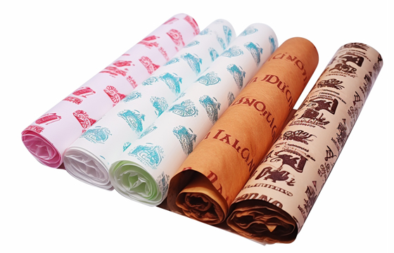
Gingham is arguably the most iconic pattern in food packaging. This simple checkerboard design is a timeless classic that evokes feelings of picnics, home-cooking, and rustic charm. It is the quintessential pattern for diners, barbecue joints, and traditional bakeries. A red-and-white gingham is the most classic combination, but the pattern works beautifully in a variety of colors. A blue-and-white gingham can feel fresh and coastal, while a black-and-white gingham can look surprisingly modern and chic. The versatility of gingham greaseproof paper sheets makes them a perennial favorite.
The Clean Modernity of Stripes
A simple stripe pattern is a master of understated elegance. Thin, clean stripes can create a look that is sophisticated, professional, and very modern. It is a pattern that is often associated with Parisian patisseries and high-end confectioners. Vertical stripes can create a sense of height and elegance, while horizontal stripes can feel more relaxed and classic. The color of the stripes also has a huge impact. A simple black-on-white stripe is a timeless choice. A more colorful stripe can feel more playful and energetic.
The Playful Vibe of Polka Dots
Polka dots are inherently fun. This simple pattern of repeating circles is cheerful, whimsical, and often a little bit retro. It is a perfect choice for businesses that want to project a fun, friendly, and approachable image. Polka dots are ideal for dessert shops, ice cream parlors, cupcake bakeries, and any brand that is targeted towards families and children. The size and spacing of the dots can also change the feel, from small, delicate dots to large, bold ones.
The Sophistication of Chevron and Herringbone
For a look that is geometric but with a bit more dynamic energy, chevron (a zig-zag pattern) and herringbone are excellent choices. These patterns create a sense of movement and sophistication. A subtle, tone-on-tone chevron pattern can look incredibly luxurious and high-end. It is a popular choice in interior design and high fashion, and it translates beautifully to packaging. It is a pattern for a brand that wants to be seen as modern, stylish, and on-trend.
Exploring Organic and Thematic Patterns
Organic patterns offer a softer, more free-flowing alternative to the structure of geometric designs. These patterns, inspired by the natural world, are perfect for brands that want to communicate a sense of elegance, authenticity, and a connection to nature.
Floral Patterns for a Touch of Elegance
A delicate floral pattern can be incredibly beautiful and elegant. It is a perfect choice for high-end bakeries, tea shops, and businesses that specialize in wedding cakes or other celebratory treats. A vintage-style floral pattern can evoke a sense of nostalgia and romance. A more modern, abstract floral can feel artistic and contemporary. A floral pattern is a way to add a touch of beauty and femininity to your packaging.
Botanical and Leaf Patterns for a Natural Feel
For brands with a focus on natural, organic, or plant-based foods, a botanical pattern is a perfect match. A simple, repeating pattern of leaves, ferns, or herbs is a direct visual cue that reinforces the brand's values. It instantly communicates a message of freshness, health, and a connection to the earth. This type of pattern is ideal for vegan cafes, health food stores, and farm-to-table restaurants.
Abstract and Artistic Patterns for a Creative Brand
For a brand that is bold, modern, and creative, an abstract pattern can be a great choice. This could be a painterly splash of color, a series of hand-drawn squiggles, or a complex, artistic design. An abstract pattern is a way to create a look that is truly unique and memorable. It signals that your brand is creative, unconventional, and not afraid to stand out from the crowd.
Thematic Patterns for Holidays and Special Events
Using patterned paper is a fantastic way to celebrate holidays and special occasions. A business can use paper with a festive pattern for the winter holidays, a spooky pattern for Halloween, or a romantic pattern for Valentine's Day. This shows customers that your brand is engaged and festive. It is a simple way to keep your packaging looking fresh and relevant throughout the year.
The Power of a Custom Brand Pattern
While there are many beautiful stock patterns available, the ultimate way to leverage this branding tool is to create your own custom pattern. A custom pattern is a proprietary design that is completely unique to your business. It is a powerful branding asset that can become instantly recognizable to your customers.
Moving Beyond Stock Patterns to a Unique Design
A custom pattern allows you to create a look that perfectly matches your brand's specific identity. You are not limited to the standard options. You can work with a designer to create a pattern that incorporates your brand's colors, shapes, and overall mood in a way that a stock pattern cannot.
Using Your Logo or Brand Icons as a Repeating Element
The most common way to create a custom pattern is to use your logo or other brand icons as the repeating element. This is a very effective way to increase brand recognition. A well-designed pattern will look great even when the full logo is not visible. This is a key part of creating truly custom-printed greaseproof paper sheets.
The Benefits of a Proprietary, Recognizable Pattern
Over time, a custom pattern can become as recognizable as your logo itself. Think of the iconic patterns used by luxury fashion brands. This is a long-term branding strategy. A unique and consistent pattern can become a valuable piece of intellectual property for your business.
Design Principles for Effective Patterned Paper
Whether you are choosing a stock pattern or creating a custom one, there are a few key design principles to keep in mind. These will help you to create a design that is effective, attractive, and professional.
The Importance of Scale and Repetition
The scale of the pattern is a crucial decision. A large-scale pattern can be bold and dramatic. A small-scale pattern can feel more delicate and detailed. It is important to choose a scale that is appropriate for the size of the items you will be wrapping. The way the pattern repeats is also important. A simple, grid-like repeat feels very orderly, while an offset or random-looking repeat can feel more organic and dynamic.
Color Theory: Choosing a Palette for Your Pattern
The color palette of your pattern is critical. A monochromatic pattern, which uses different shades of the same color, can be very sophisticated and understated. A high-contrast palette, like black on white, is bold and easy to read. A multi-colored palette can be fun and energetic. The colors in your pattern should always be in harmony with your main brand colors. Using a pattern is a great way to add visual interest to simple coloured greaseproof paper sheets.
Balancing Pattern Complexity with Readability
It is important to find the right balance with complexity. A very dense and detailed pattern can sometimes be too "busy." It can make it difficult to see your logo if you print one over the top of it. It can also visually overwhelm the food product itself. Often, a simpler, more open pattern is more effective. The goal is for the pattern to be a beautiful background, not the main star of the show.
Here are some key design principles to consider:
- Scale: Choose a pattern scale that is appropriate for your products. A small pattern for a small pastry, a larger one for a big sandwich wrap.
- Color Palette: Ensure the colors in your pattern align with your brand identity and complement the colors of your food.
- Complexity: A simpler, more open pattern is often more versatile and professional than one that is overly busy.
- Brand Integration: If you are adding a logo over the pattern, ensure it has enough clear space around it to be easily readable.
- Timelessness: Choose a pattern that will still look good in a few years. Avoid anything that is too trendy if you are looking for a long-term solution.
How to Choose the Right Pattern for Your Business
The perfect pattern for your business is one that authentically reflects your brand's personality and appeals to your target customer. Here are some suggestions for different types of food businesses.
For a Classic Diner or Barbecue Joint
For a business with a retro, Americana feel, a gingham pattern is the undisputed champion. It is classic, nostalgic, and perfectly suited to this style of food. Simple stripes or polka dots in a retro color palette would also be a great choice.
For a Modern, Minimalist Café
A modern café with a clean, minimalist aesthetic should choose a pattern that reflects this. A simple, thin stripe pattern in a monochrome color scheme (like grey on white) would be very effective. A subtle, small-scale geometric pattern would also work well. The goal is elegance and simplicity.
For an Artisanal Bakery
An artisanal bakery that emphasizes natural, handmade products should choose a pattern with an organic feel. A hand-drawn botanical or floral pattern would be a beautiful choice. A custom pattern based on a key ingredient, like a wheat stalk, would also be very effective. A natural brown base paper is often the best choice for these businesses.
For a Fun Dessert or Candy Shop
For a business that is all about fun and indulgence, a playful and colorful pattern is a must. Brightly colored polka dots, fun abstract squiggles, or a thematic pattern of ice cream cones or candies would be perfect. The goal is to create a sense of joy and excitement.
Technical and Production Considerations
When you have finalized your design, there are some technical factors to consider. These relate to the production of your patterned greaseproof paper sheets.
The Printing Process for Detailed Patterns
A detailed, multi-color pattern will be printed using the same flexographic printing process as a simple logo. However, a more complex design will require more printing plates and a more complex setup, which can increase the cost. It is important to provide the artwork in a high-resolution vector format to ensure all the fine details of the pattern are printed cleanly and sharply.
Ensuring Food-Safe Inks and Materials
This is a critical safety requirement. All the inks used to print your pattern must be certified as food-safe and non-toxic. The base paper itself, whether it is a bleached white greaseproof paper sheet or an unbleached one, must also be a food-grade material. Always work with a reputable supplier who can provide these safety certifications.
Final Thoughts
The use of patterned greaseproof paper sheets is a brilliantly effective way for a food business to create a distinct and memorable brand identity. A well-chosen pattern is more than just a decoration; it is a powerful communication tool. It can set a mood, tell a story, and create a deep emotional connection with the customer. From the timeless charm of gingham to the modern elegance of a custom-designed brand pattern, the possibilities are endless. By thinking strategically about design and choosing a pattern that truly reflects the heart of your brand, you can turn your everyday food packaging into your most effective marketing asset.
JERL has been working hard on the road of custom packaging. Next time when you feel the need to impress someone with your brand, think of JERL Packaging!